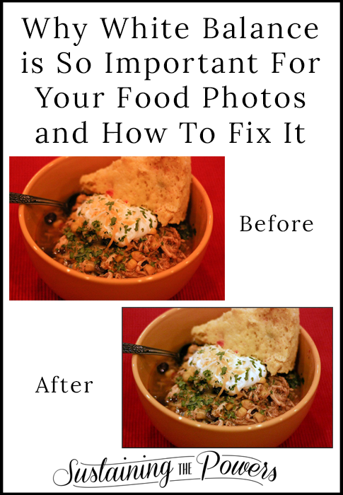
Step-by-step tutorial for how and why to adjust white balance in your food photos with free Pic Monkey photo editor.
I’m sure you’ve all heard that we eat first with our eyes. That makes food photography super important. You can have a super amazing recipe, but if your image is a blurry brown blob, you probably won’t have people jumping up and down and drooling. I don’t want to call any other bloggers out or embarrass anyone, so I took my own blurry blob photo to demonstrate my point:
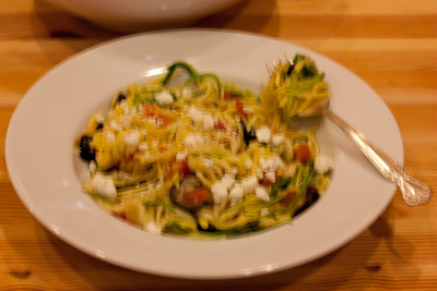
Not very appetizing right? Can you even really tell what it is? Would you re-pin it on Pinterest? Share on Facebook? Maybe I would if it was a really great recipe, but I don’t know that I would get past the photo to try it out unless someone told me about it.
What about this one?
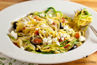
Much better right? Practically night and day. You can see what it is, and the bright, well-lit photo makes you want to dive right in. (This photo is from my Greek Zucchini Noodles recipe by the way.)
Now, I’m not here to say that you need to have cookbook-worthy food photos, but I think everyone knows that you need to grow your skills at food photography from that blurry image above if you want to grow your blog’s exposure. I decided early on in my blogging adventure to learn everything I could find about food photography, so I want to share what I’ve learned so far and make learning how to get better easier for you. Today we’re going to talk about the #1 thing that makes food photos look better: white balance.
And just so you know where I’m coming from, I want to share this side by side of where I started with my food photography in October 2013, and where I was back in October 2014 when I wrote about my 1 year blogiversary.
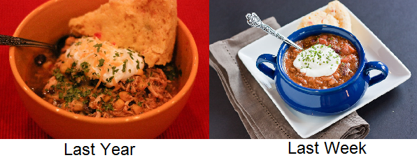
Those are essentially the same dish. My Texmex Chicken Chili is on the left and my Turkey Chili is on the right. Huge difference right? The biggest difference (besides the plating and how zoomed in I am) is the white balance.
What is White Balance?
White balance is often called “temperature” or “warmth”, and basically refers to how blue or yellow an image is. The ideal white balance for an image would have the white elements of a photo show up as pure white. You can see that the sour cream and the white plate in the right image is pretty spot on, but the sour cream in the left image is yellowed. In this case, you’d say that the image on the left is much” warmer” than the image on the right. (And much too warm to be really appetizing.)
This “over-warmth” is what you often get when you take photos under your normal household lights or at a restaurant. (The image on the left was in my kitchen after dark with the incandescent overhead lights on.) Most people prefer to have warmer lights in their home because they make the rooms feel cozy. That’s awesome until you go to take a photo of your dinner and it looks “weird” and too warm. I’ll be the first to tell you that natural light is the best way to solve this over-warmth, but what do you do if you have a bunch of photos like the bowl of chili above? You can adjust their white balance!
How can we fix white balance?
There’s a bunch of ways we could get technical about what’s “perfect” and how to use fancy software like Photoshop or Lightroom to adjust white balance, but chances are good that if you own that software you’re probably already in the know about white balance. So, today we’re going to take a look at one of my favorite free tools to adjust white balance: Pic Monkey!
How to change white balance in Pic Monkey:
If you’ve never used Pic Monkey before, it’s super easy to use. The only thing you have to remember is that you can’t undo more than 1 step, and nothing is saved in Pic Monkey, so always download your image from time to time as your’re working on it. It’s not my favorite app for drastic changes, but it’s great for uploading a photo and quickly shifting the white balance.
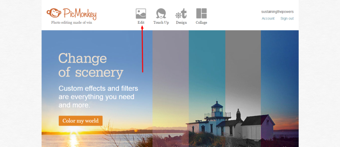
Go to the PicMonkey Website
Click “Edit” and browse to the photo you want to work on.
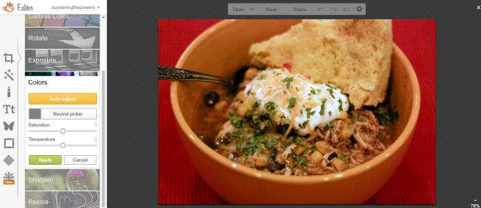
You’ll see the “Basic Edits sidebar” when your image first opens, so just click on the “Colors” option.
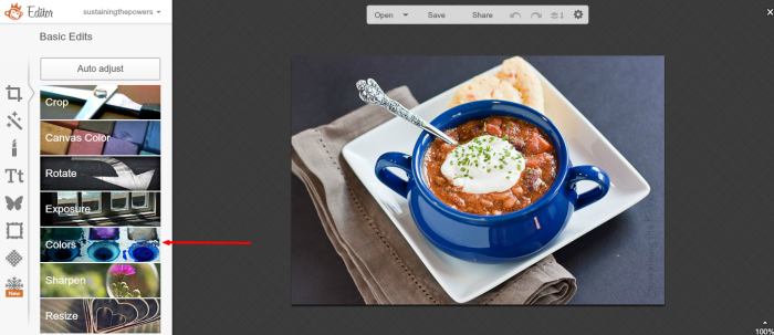
Now you’ll see several sliders that control the colors in your image.
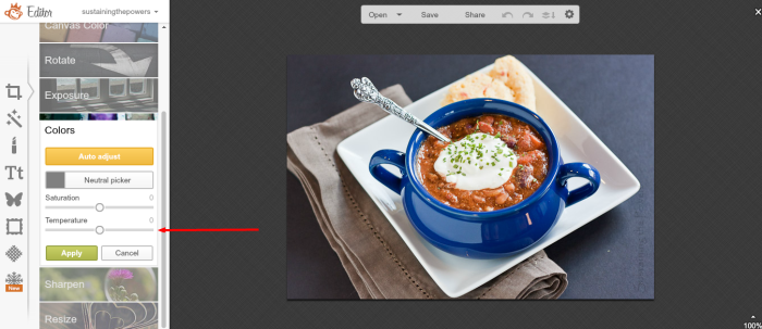
You can start with the yellow button that says “Auto Adjust.” If your image was already pretty close, it will get you where you need to be.
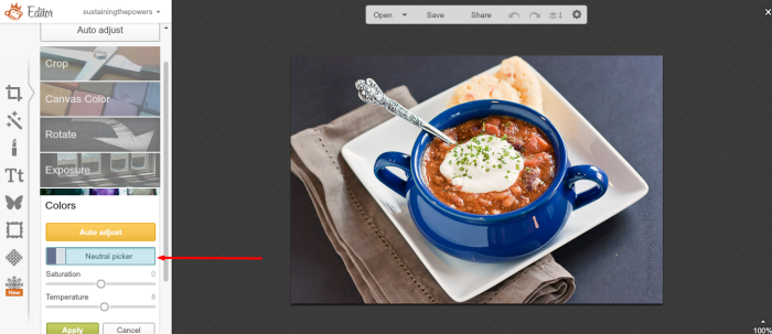
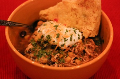
There’s also the “Neutral Picker” button. Click that and it will turn your cursor into an eye dropper. Click the eye dropper on a white or light grey surface in your image, and it will make that point the perfect white. The image above with the white plate is perfect for doing this. But it doesn’t always work. Here it is on my chicken chili photo from a year ago:
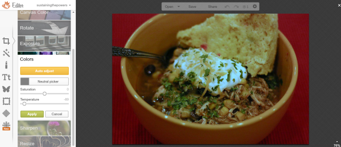
I used the eye dropper on the white sour cream and that suddenly looks green and really unappetizing.
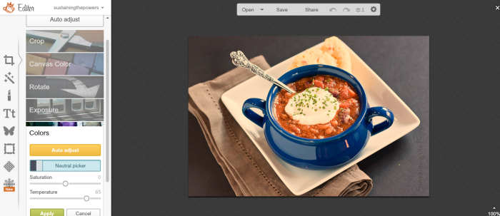
No worries, you can just use the “Temperature” slider and move it left and right until the image looks yummy to you. I think the best color temperature/white balance for food is just a tad on the warm side so the food looks hot, but it’s really a personal preference, so adjust until you like what you see.
Click “Save” at the top to save the photo and you’re done! Super quick!
I wanted to show you a few more examples so you can see what a difference this makes.
Here’s the chili a little on the cool side: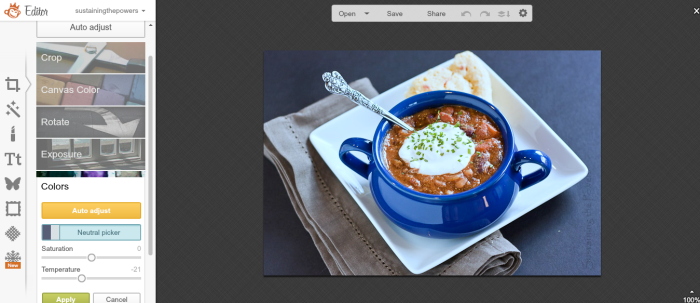
Here it’s a bit too much on the warm side:
Here I feel like it’s just right:
Here’s the other image that started too warm:
Here it is adjusted with Pic Monkey:
Doesn’t that already look a lot better?? I sure think so. (Maybe I’ll go back and update that photo in the actual post now!)
Combine this white balance tip with my $2 secret for better lighting in your blog photos, and my instructions for building your own DIY (Lowel Ego) softbox photography light and you’ll be shooting photos just like (or better!) than mine in no time!
(And p.s. there’s a warmth slider on Instagram too if you like taking cell phone photos like I do.)


Thank you for sharing all these tips! I’ve been learning a lot about food photography, and I’m always excited to find new tips. It’s really cool that we can do all this in PicMonkey!
You’re welcome!
Wow, I don’t do any food photography, but I like my pictures to look good!! Who doesn’t, right!? Thank you so much for these tips — they’re going to come in handy!
You’re totally right! Everyone likes their photos to look good. I’m presenting these tips from the perspective of food, since that’s what I shoot most often, but most of them will apply to anyone using a camera. I’m glad they can help you!
This is such a important tutorial! I think since food pictures need to look their best, if you don’t have the best light it’s not going to look appetizing! Thank you for the helpful tutorial, especially for those who don’t have Photoshop!
I’m glad I could help Lauren! When I was first learning, I saw so many photography tutorials that say do this or do that but mainly aim for advanced photoshop users or don’t give real, hands-on practicals. I’ve been trying to make this series more accessible for people who don’t have advanced software and want to be able to apply what they learn right away.
Food photography is where I struggle. Thanks for the tip! I do use Lightroom, but struggle with balance – it’s a fine line between “I think that looks pretty normal” and “Overdid it!”
I totally do that too! I almost always use Lightroom for my editing, but wanted to show an option that anyone can have. You can use the neutral picker in lightroom as well. (I have a few lightroom tips planned for this series too.) At the top of the “develop” sidebar there’s and eye dropper. Just select it then click it on a white or grey pixel in your image and it will adjust the white balance for you. I usually use that and then nudge it up just a bit more to the warm side since that’s where I feel food looks best. (And if I’m not using a white plate or dish, I’ll usually take a single shot with a white index card in it, use the neutral picker, and sync those settings across the other images in the set.)
Thank you so much for this tutorial! I just put it to good use for my post tomorrow. 😉 I had no idea I could do this.
Do you usually save in JPEG or PNG when using PicMonkey? PicMonkey is my go-to right now since I’m still learning photography and editing. So nice to have a cheap tool. 🙂 I’m so appreciative for tutorials like yours, too!
Awesome!! I’ll look for your post. When I save from picmonkey, I prefer to use jpeg for photos because they will have the best color and crispness. The only time I use png is when I’m creating computer-generated images (Like the pinnable image for this post, infographics, printables, etc) or images with lots of text overlay because those graphics seem to compress better with png.
Thant’s a great article! Very useful!